Fluantly is a project for Design Thinking for User Experience Design, Prototyping & Evaluation.
Problem and Solution Overview
Our mission is to empower people to use language as a means to meet new people. People are discouraged from learning a language because of the time-consuming process. They also lack the opportunity to practice conversations with others while learning. Fluantly provides a more flexible experience for language learners so they can practice with others through focused conversations. On our platform, people can choose their topics, get feedback from others, meet new friends, and share progress with family and friends.
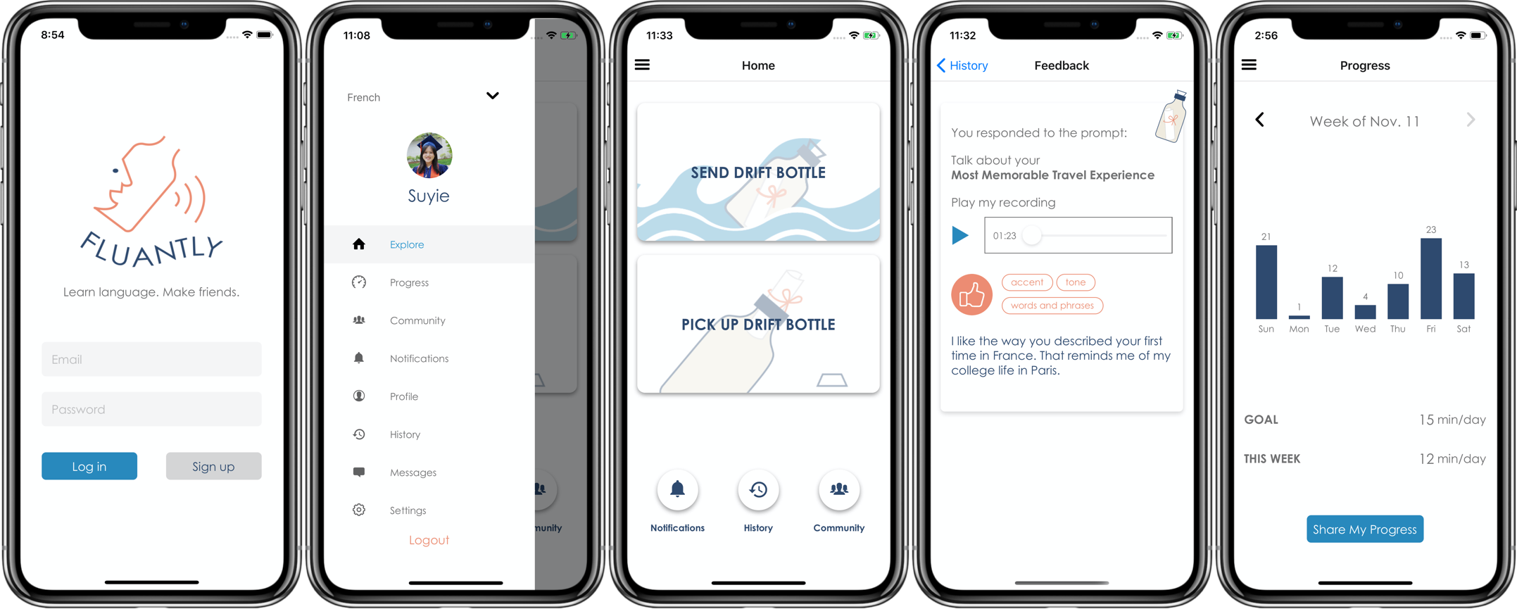
Figure 1: Design Overview
Concept of Drift Bottles
Our design is based on the concept of drift bottles. Drift bottles are a form of communication where messages are sealed in a bottle and thrown into the sea. We often think of them as a means for survivors lost on an uninhabited island to seek help; meanwhile, many people use drift bottles to receive messages from anonymous people and make pen pals.
During our needfinding process, we realized that many people appreciate friendship they have made during or after their language learning process, which inspires our idea to combine the concept of drift bottles with practicing languages, whereby users can send audio messages to and receive recordings from other users (anonymously). If they are willing to, they can decide to befriend each other and interact further. We believe that anonymity creates a sense of mystery will allow people to genuinely seek to expand their networks.
Tasks & Final Interface Scenarios
Task 1: (Simple) Browse and select topics of interest for a conversation
Practicing and learning conversational languages is the core functionality of the platform, and therefore we believe selecting topics of interest to practice is one of the most frequent activities for users. Besides, recording and sending drift bottles are crucial to many other functionalities such as receiving feedback and sharing progress.
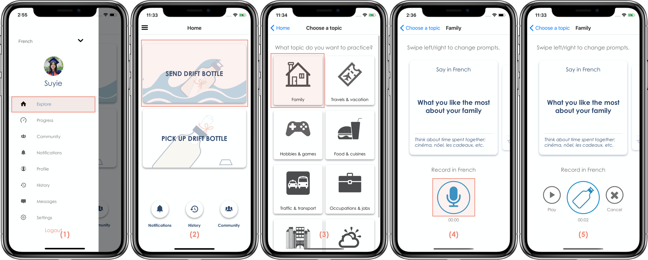
Figure 2: High-fi Prototype - Task #1
- The starting point of this task is the landing page (2) after logging in; it is also accessible from the universal sidebar (1). Before starting practice, users can select the language to practice in the sidebar (1).
- Users select “send drift bottle” (2) and tap on a topic (3). Users can swipe left or right to select a question to practice (4), where they can see some prompts of commonly used vocabulary.
- Users press the microphone button to start recording (4). When finishing, they can play their recording and choose whether to send or to delete the audio (5).
Task 2: (Moderate) Send feedback to conversation partners & Receive feedback from conversation partners
Receiving feedback from others is important for language learners. For this reason, we hope that this could be a frequent task. Besides, we include sending feedback in this task, since only after some users listen to the audios and leave comments, can the senders receive feedback.
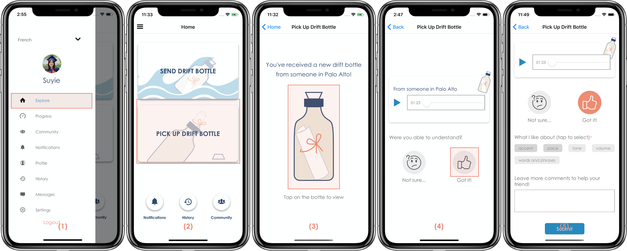
Figure 3: High-fi Prototype - Task #2 - Send Feedback
- The starting point of this task is the landing page (2) after logging in; it is also accessible from the universal sidebar (1). Before picking up a drift bottle, users can select the language to practice in the sidebar (1).
- Users select “pick up drift bottle” (2) and see a message that they have received a new drift bottle, where they can tap on the bottle to continue (3).
- Users can play the video as many times as they want. They can select one from “Not sure” and “Got it” to start giving feedback based on their understanding of the audio. On the next screen, users can answer some follow-up questions and make suggestions.
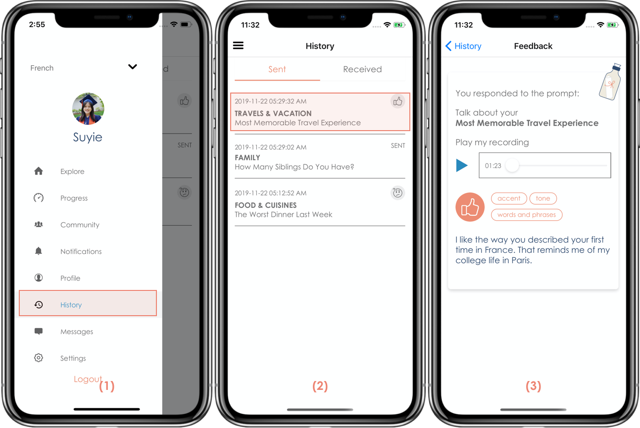
Figure 4: High-fi Prototype - Task #2 - Receive Feedback
- Users can see all audio messages they have sent and received in the “History” section (2) from the sidebar (1).
- After selecting a drift bottle, users can see what comments and feedback they have received or sent (3).
Task 3: (Complex) Share progress with friends and family
Many people feel content after they achieve their goal of learning a language, so we believe sharing progress is a way to encourage users to practice more. We categorize this task as a complex task because compared to the previous two tasks, this is less likely to be performed often.
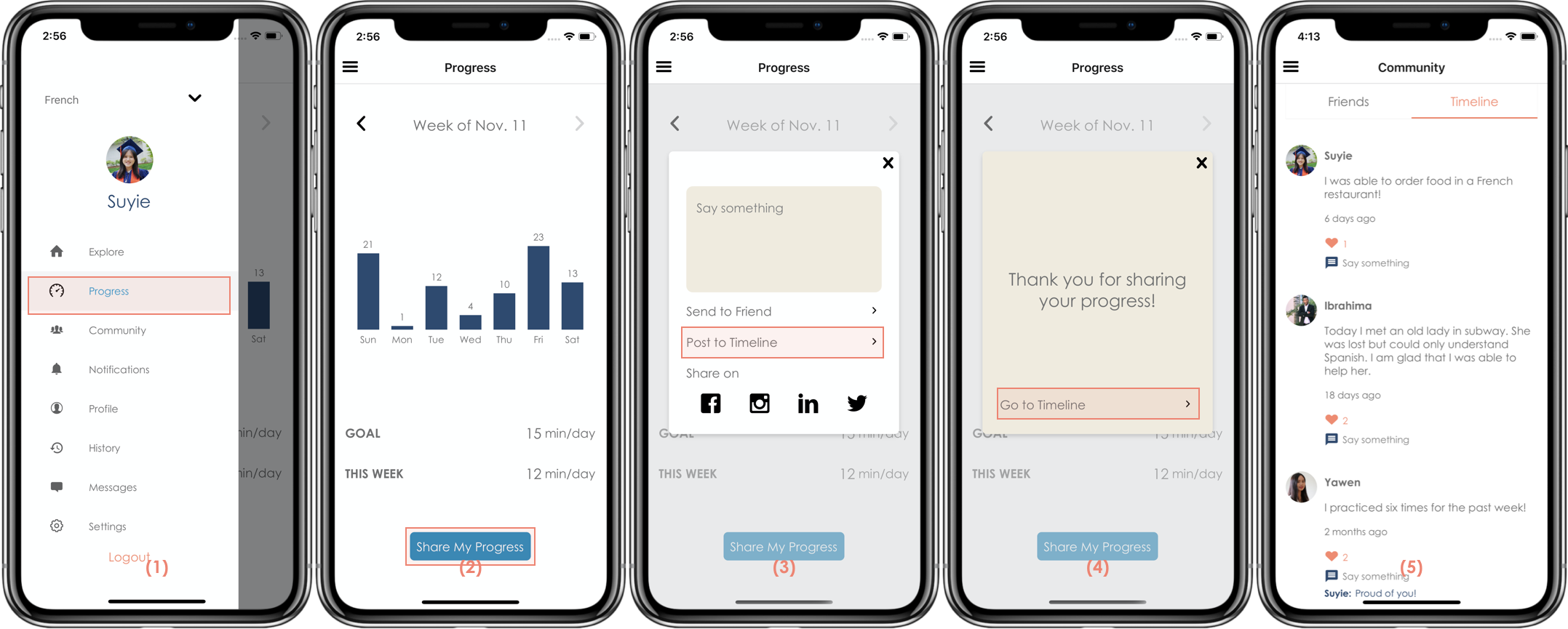
Figure 5: High-fi Prototype - Task #3
- Users can see their weekly progress as bar charts (2) from the sidebar (1). They can go back or forward to view all the progress they have so far.
- Users can share their progress by pressing the share button (2), where they can edit the text message (3) and send directly to a friend (not implemented), post to timeline and share on social media (not implemented).
- If they choose to post to the timeline, a confirmation message will be shown (4). By pressing the “Go to Timeline” button users will be redirected to the timeline page (5), where they can see all posts from friends and themselves in reversed order, including the text they just typed.
- The timeline page belongs to the “Community” section, which is accessible from the sidebar as well.
Design Evolution
Initial Sketches
During the stage of initial sketches, each of us brainstormed three design directions and created sketches, including desktop applications, mobile applications, watch applications and VR. After analyzing the novelty and feasibility of each sketch, we decided to proceed with the mobile application with the drift bottle concept, with all three tasks addressed.
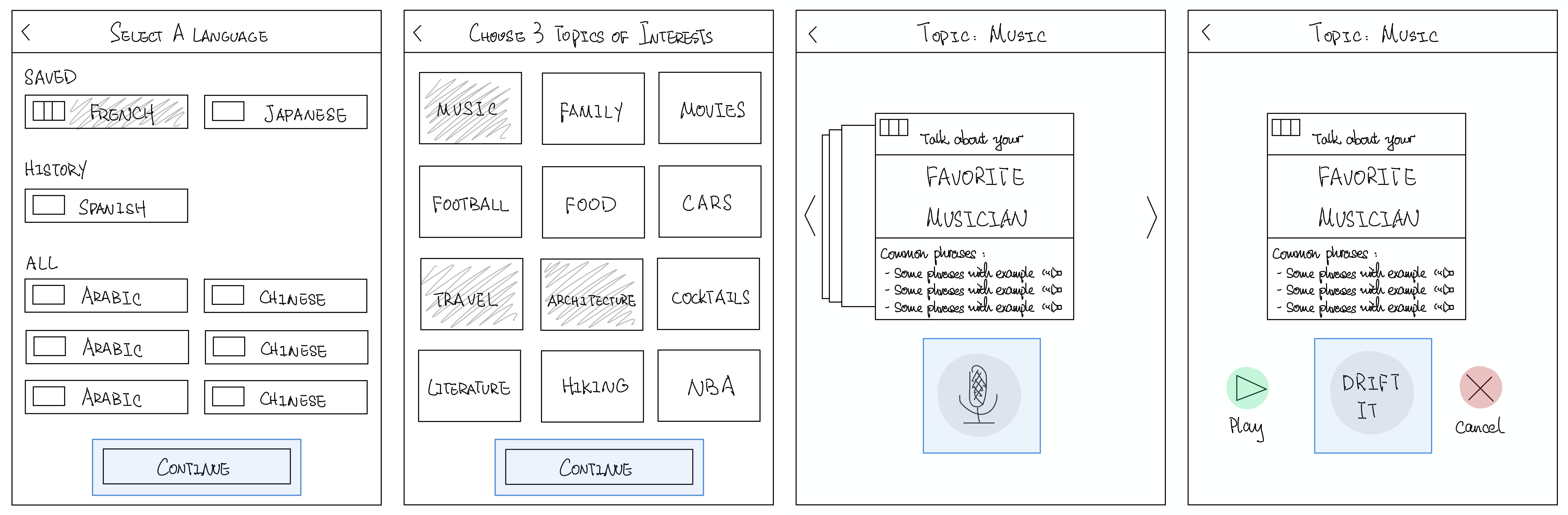
Figure 6: Initial Sketches - Task #1 Select Topics
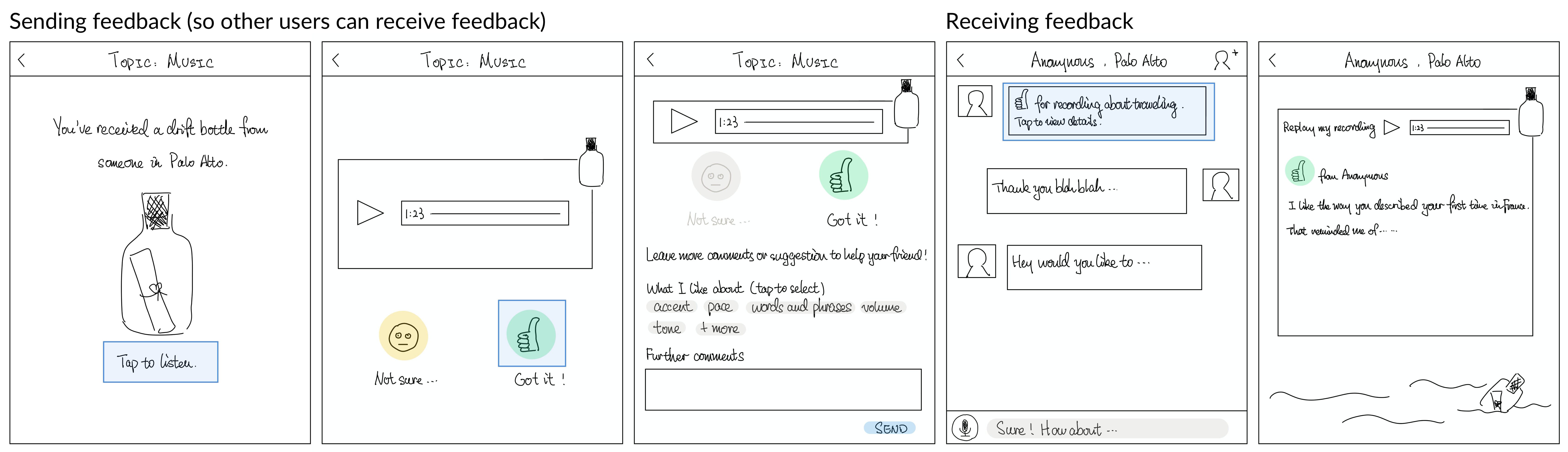
Figure 7: Initial Sketches - Task #2 Send & Receive Feedback
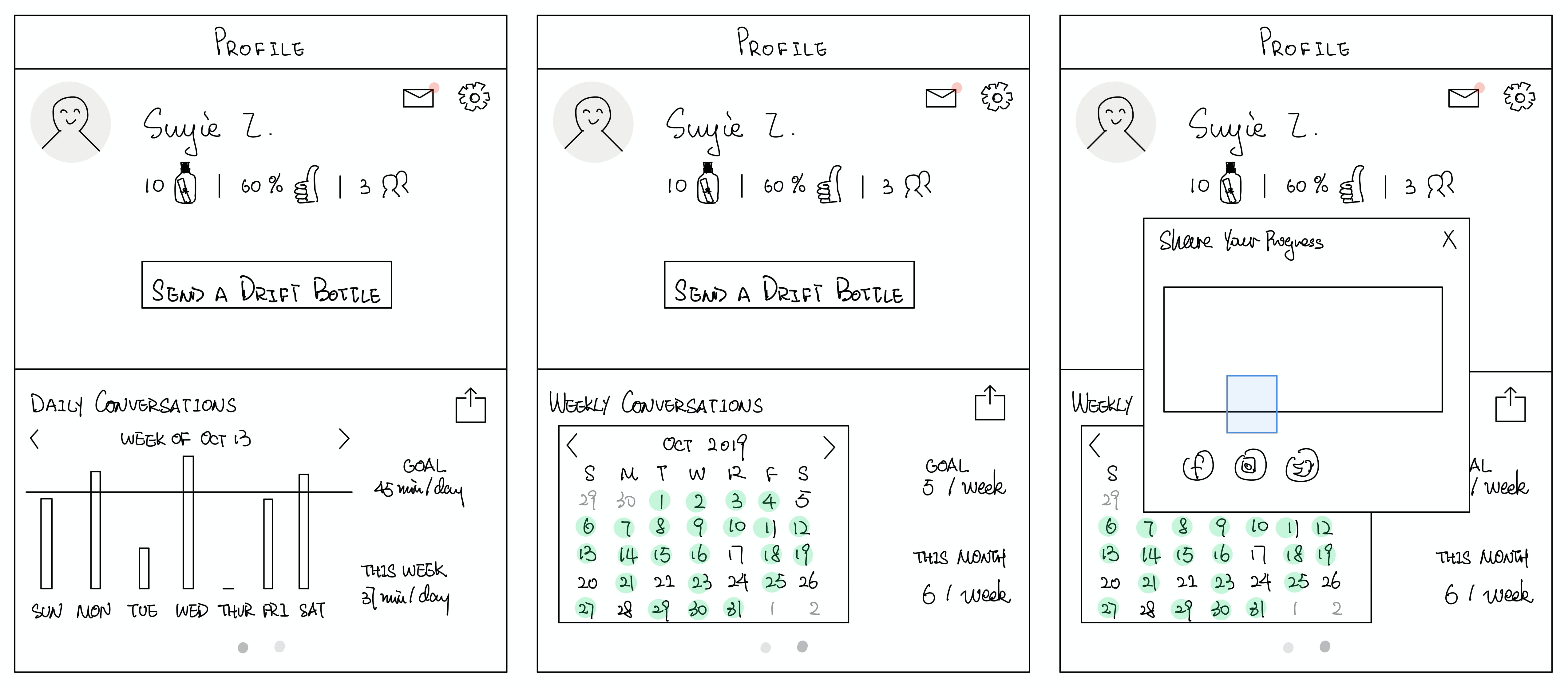
Figure 8: Initial Sketches - Task #3 Share Progress
Low-fi Prototype
We used iPhone templates from the website sneakpeekit and printed them in color for our paper prototype, with other pieces of paper to simulate swiping interactions, and WhatsApp to record or play a recorded message.
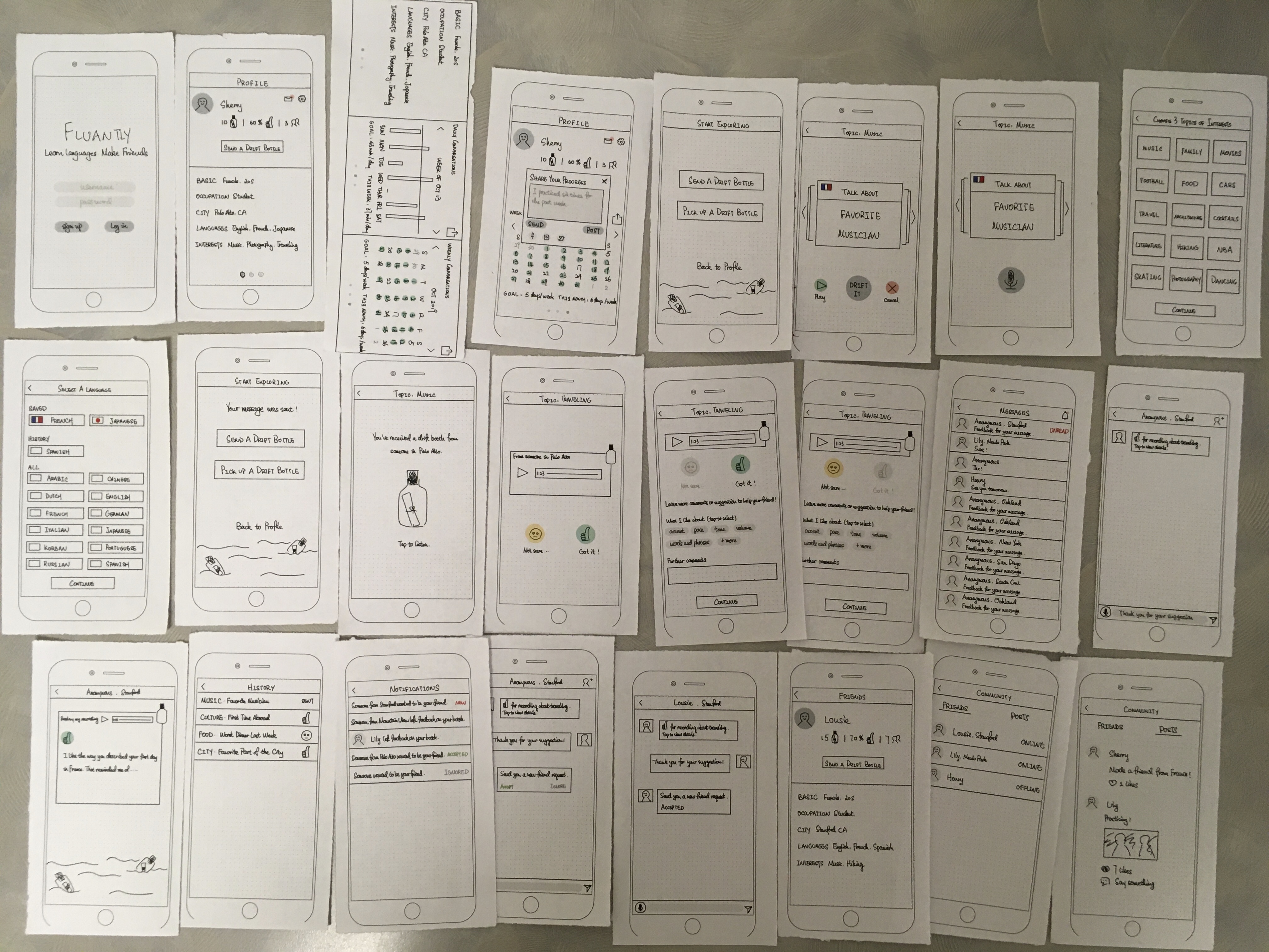
Figure 9: Low-fi Prototype
Med-fi Prototype
We used Adobe XD for our medium-fidelity prototype and used iPhone X as our target platform.
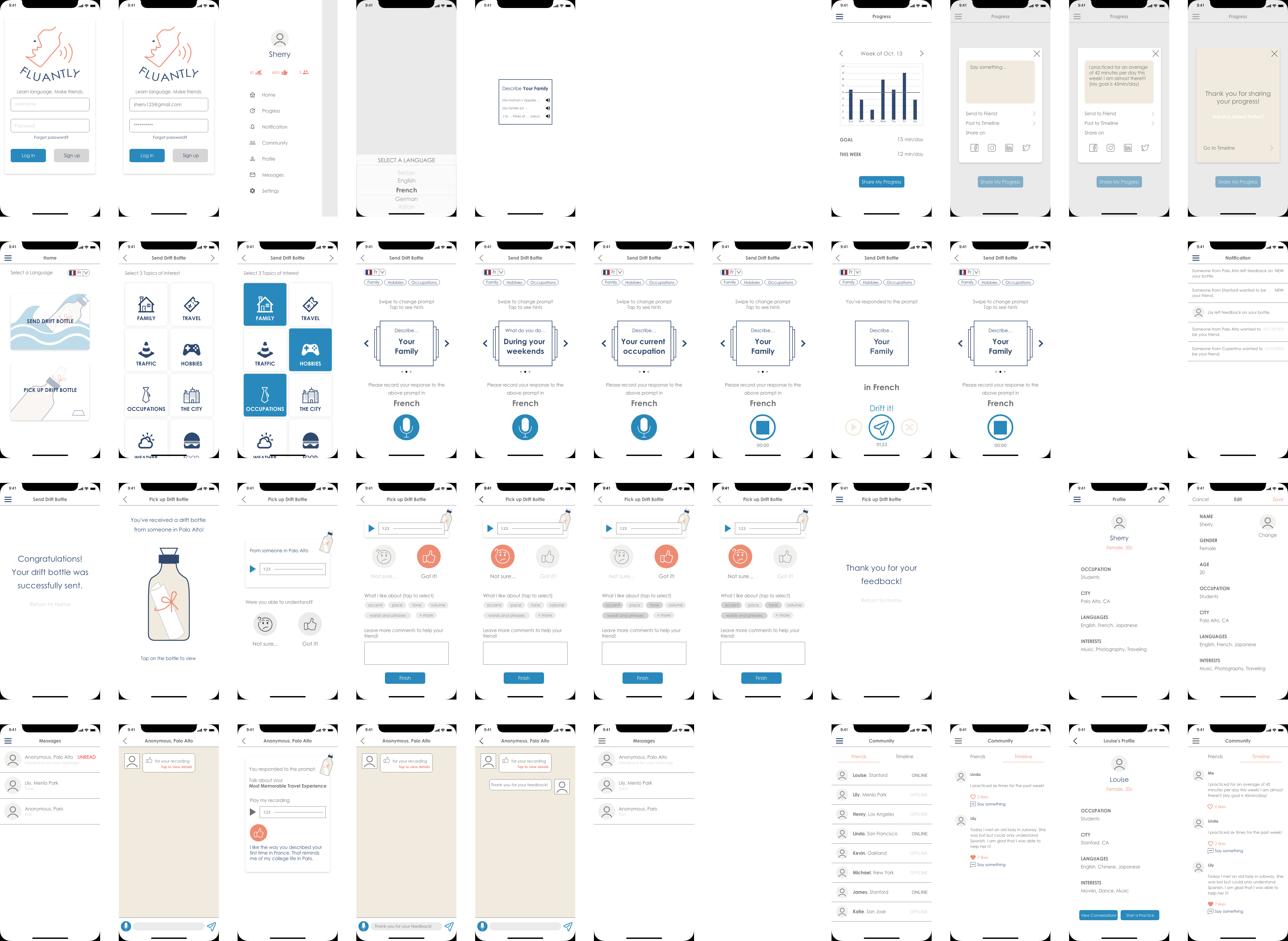
Figure 10: Med-fi Prototype
Major Design Changes from Initial Sketches to Med-fi Prototype
During our usability test, we targeted users who showed interest in learning languages, and represented different levels of fluency: two were beginners and the other two were fluent speakers. We realized that the app was quite complex to navigate overall and the “drift bottle” concept was counterintuitive as far as practicing language was concerned. There was also space for improvement in user interfaces, as shown below.
Change #1: Landing Screen
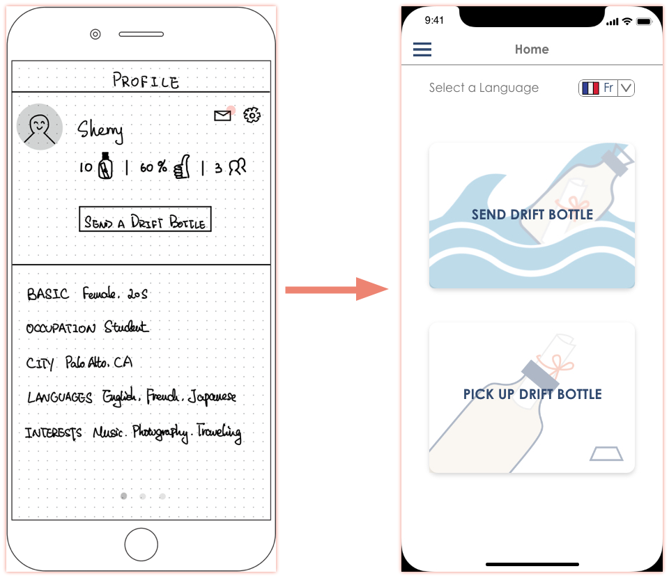
Figure 11: Major Design Changes - Landing Screen
In our initial sketches and low-fi prototype, the landing screen consists of the top half and the bottom half. In the top half, the user can press the “Send a Drift Bottle” button to start the practice or tap on the envelope icon to view all messages. The bottom half is a swipeable section that includes the user’s basic information and learning progress. However, our usability test on the low-fi prototype reveals that most of our participants had trouble navigating the app from the landing screen and were easily stuck on the first step.
Therefore, in our med-fi prototype, we decided to make our “send drift bottle” and “pick drift bottle” tasks more visible on the home screen. Instead of having the profile as the home screen, we place two large buttons for both tasks on the home screen so that the user can easily navigate the tasks once logged in.
Change #2: Sidebar
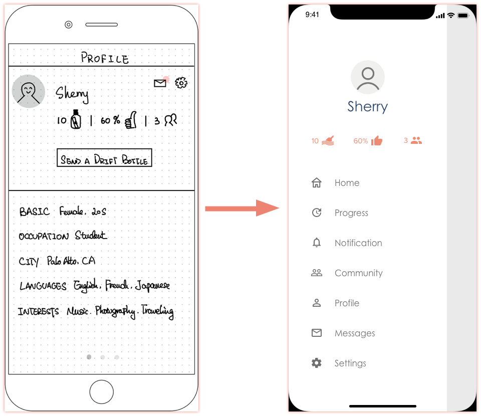
Figure 12: Major Design Changes - Sidebar
As mentioned in change #1, users would have to navigate through the landing screen, which is not an intuitive way of arranging the information. Our usability test results indicate that our participants spent the most amount of time on the first task, and the time spent on the second and the third task dropped accordingly.
In our med-fi prototype, to make our app easier to navigate, we decided to add a sidebar on the left. When the user clicks on the hamburger icon on the top left corner, a sidebar will show up from the left. Through the sidebar, the user will be able to enter our home screen, progress screen, notification screen, etc. We found this organization of information more clear and intuitive.
Change #3: Progress Sharing Screen
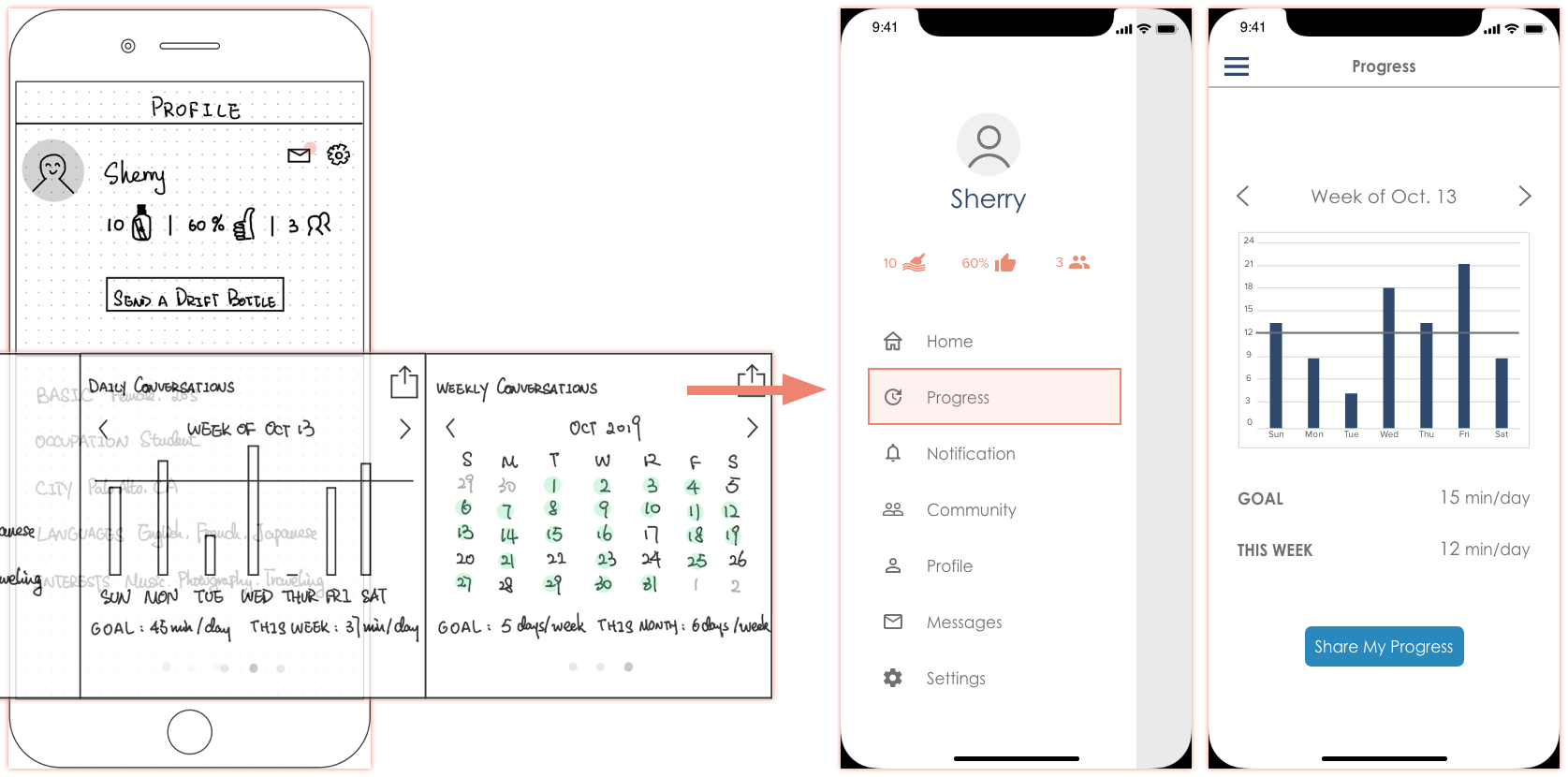
Figure 13: Major Design Changes - Progress Sharing Screen
In our initial sketch and low-fi prototype, the progress is located at the bottom half of the home screen. Since the user has to swipe left to see the weekly progress and calendar, this information is not easily visible. During our usability test, our participants were not able to complete task #3 until given hints about the swiping feature. Moreover, the share icon is not recognizable enough.
In our med-fi prototype, we created an independent screen for progress, where the user can see his/her weekly progress. The “Share My Progress” button is now below the progress info. Also, we decided to remove the calendar because our participants had trouble understanding its use.
Change #4: Language Choice
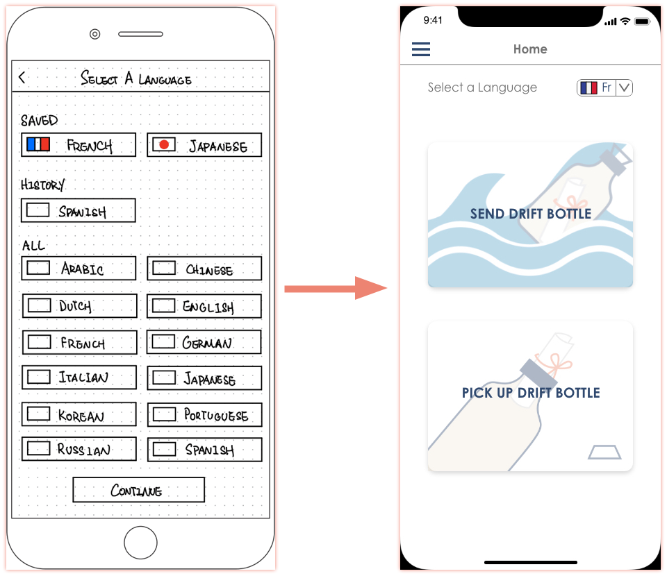
Figure 14: Major Design Changes - Language Choice
Another major change is the location of language selection. In our initial sketches, the user will be asked to select a language only in task #1 - send a drift bottle. But if the user wants to pick a drift bottle, he/she won’t be asked to select a language, which is not reasonable since the user probably expects to hear the language he/she practices or understands.
After realizing this flaw in our design, we moved the language selection from task #1 to the home screen in the med-fi prototype. So before the user sends/picks a drift bottle, he/she needs to select a language first.
Major Usability Problems Addressed
Problem 1: Language Choice (Heuristic Evaluation #6)
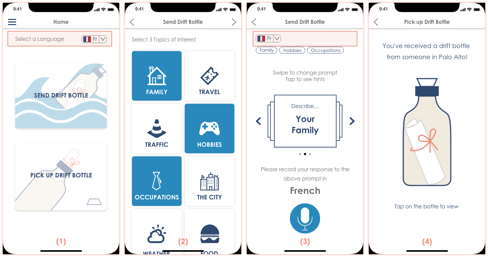
Figure 15: Usability Problems: Language Choice - Before
Users can choose the language they want to practice on some screens, such as the home page (1) and the recording screen (3), but not in others, such as the topic selection page (2) and when picking up a drift bottle (4).
- Type: H4 - Consistency and Standards
- Severity: 3
- Also: Heuristic Evaluation #22 #23
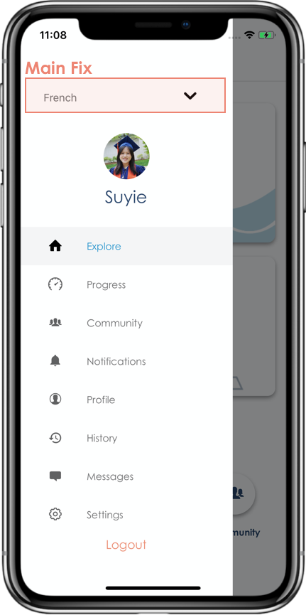
Figure 16: Usability Problems: Language Choice - After
Fix: We put the language selection in the universal sidebar (the hamburger menu). The default language is used for sending and picking up drift bottles.
Problem 2: Flow of Notification and Feedback (Heuristic Evaluation #5)
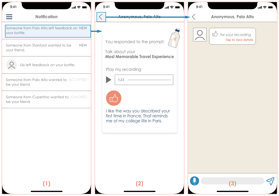
Figure 17: Usability Problems: Flow of Notification and Feedback - Before
Users can tap a new notification (1) and views feedback on the drift bottle (2). If they decide to press the back button, they are directed to the messages section (3).
- Type: H2 – Match Between System & Real World
- Severity: 4
Fix: This incorrect flow is due to the limitation of the prototype tool since it is hard to predict where users will access the detailed feedback page (2). This will be resolved automatically in implementation using the stack navigation.
Problem 3: Receiving Feedback (Heuristic Evaluation #12)
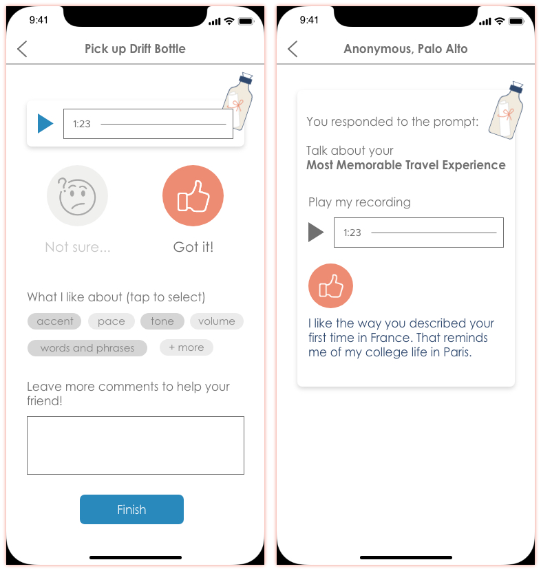
Figure 18: Usability Problems: Receiving Feedback - Before
On providing feedback, the feedback sender can select what they like/disliked and leave a comment. Upon receiving it, the user does not see the choice of likes/dislikes from the sender. It is unclear what is the required field and what is not.
- Type: H4 – Consistency and Standards
- Severity: 3
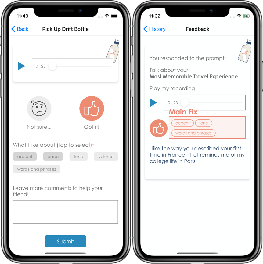
Figure 19: Usability Problems: Receiving Feedback - After
Fix: We show section on received feedback displaying what the user liked or disliked.
Problem 4: Viewing Feedback (Heuristic Evaluation #18)
The only way for a user to view previously sent drift bottles is via messages. The process is complex and it is not an effective way to review received feedback.
- Type: H6 – Recognition rather than recall
- Severity: 3
- Also: Heuristic Evaluation #1
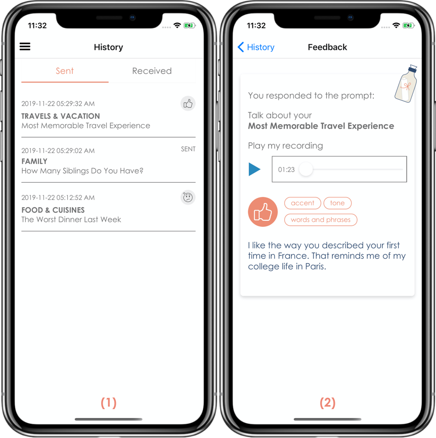
Figure 20: Usability Problems: Viewing Feedback - After
Fix: We put the bottles sent into a new section “History”, and clicking on one shows the feedback received on the particular bottle. All picked up drift bottles will also show up under history. The selected drift bottle will show what comments and feedback were provided.
Problem 5: Picking up a (New) Drift Bottle (Heuristic Evaluation #18)
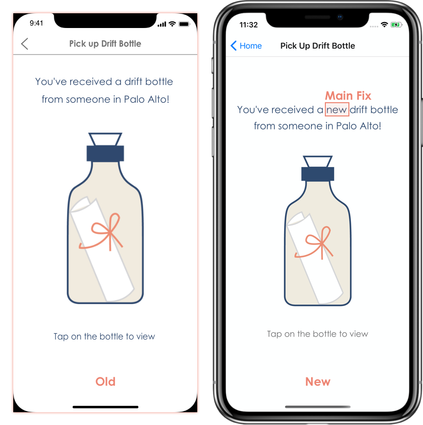
Figure 21: Usability Problems: Picking up a (New) Drift Bottle
When the user taps “Pick Up Drift Bottle”, the platform does not make it clear to the user that the drift bottle they’re seeing is a new one they never reviewed before.
- Type: H1 – Visibility of system status
- Severity: 3
Fix: We added the word “new” to make it clear to the user they’re seeing a bottle they never picked.
Other Major Changes
Home Page
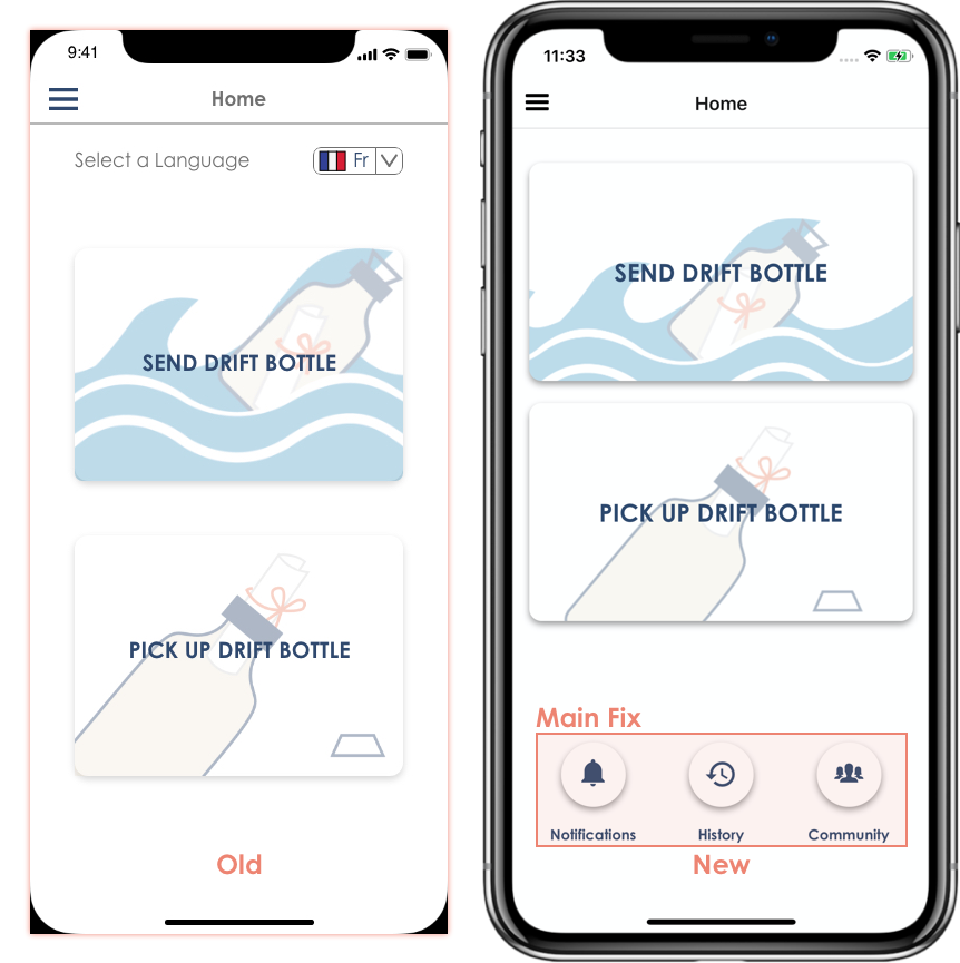
Figure 22: Usability Problems: Homepage
We added three buttons on the home screen, notification, history, and community, to make those sections more visible. (Heuristic Evaluation #32)
Sidebar
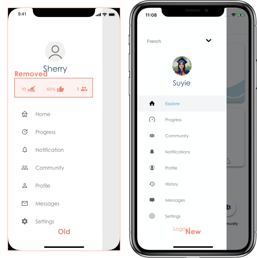
Figure 23: Usability Problems: Sidebar
We removed icons under the profile picture in the sidebar since the meanings were unclear. (Heuristic Evaluation #7)
Topic Selection
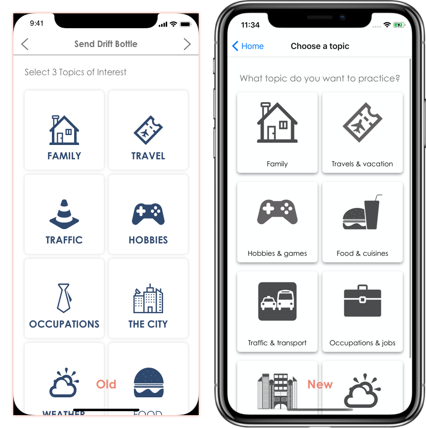
Figure 24: Usability Problems: Topic Selection
Instead of choosing three different topics, users can only select one topic. (Heuristic Evaluation #3). This also solves the issues that the “next” button was unclear (Heuristic Evaluation #19 #20 #21) since right now users can click on one topic card and proceed (Heuristic Evaluation #17 #26)
Recording Page
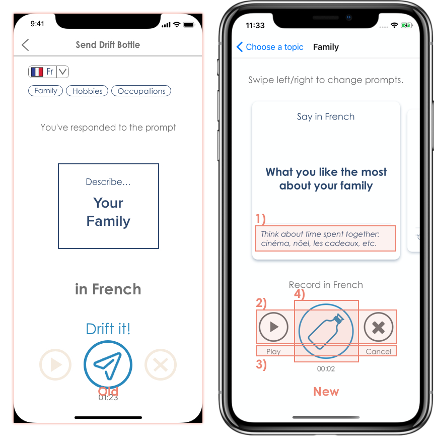
Figure 25: Usability Problems: Recording Page
- Users can see hints directly instead of tapping the card first.
- We changed the color of “play“ and “cancel” buttons to make them more clear. (Heuristic Evaluation #13)
- We added text below options to avoid ambiguity (Heuristic Evaluation #9)
- We changed the “send” icon to a bottle to better match our theme.
Feedback Page
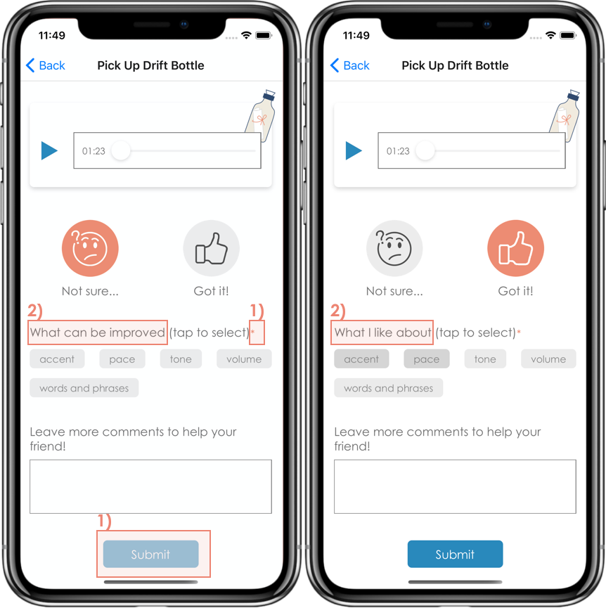
Figure 26: Usability Problems: Feedback Page
- We added a star to indicate that the section “What I liked about” is compulsory and that the text field is optional for the sender of feedback. The submit button is at the disabled state until the user has selected something.
- We changed the prompt question based on the user’s choice. (Heuristic Evaluation #11)
Notification and Message Sections
We decided not to implement these two sections due to the limited time we have. In particular,
- We extract the portion of feedback from “Notification” into “History” since it is more important to our task 2 (to receive feedback).
- For task 3 (to share progress) we choose to implement “post to timeline” in real-time instead of “send to friends” to avoid additional work in implementing the chatting functionality.
Prototype Implementation
Tools
To build our prototype, we mainly used React Native (with Expo.io) and Google’s Firebase.
React Native proved to be an extremely useful tool for building our prototype. React Native is a cross-platform mobile app framework that offered us a lot of useful modules. Using many of the pre-built modules that React Native provides, we did not need to build many components from the ground-up. Speaking of components, React Native makes it easy to re-use them in a way that allowed us to build a component once and reuse it as many times as we wanted. We used React Native with Expo.io. Expo makes it easier to have access to native properties of mobile devices (audio, camera, location, etc.). Since Fluantly relied heavily on Audios, we found expo-audio to be extremely useful for the realization of our app. Unfortunately, React Native also presented some drawbacks. We found it hard to send data from one screen/component to another. Using Redux would have perhaps made that easier for us.
In addition to React Native, Firebase was crucial to our app. Since we needed to exchange drift bottles, feedback, and other relevant information between users, we needed to have a persistent way of storing information, which justified the use of Firebase’s cloud storage. We also used the Firebase Authentication for logging in/out users as well as signing them up. With Firebase, we did not need to worry much about session management since all of that was taken care of by Firebase. Finally, we used the Firebase database. This service helped with maintaining relevant information for each user. While Firebase played a crucial role in our app, it was very hard to find useful documentation. To some extent, the BAAS (Backend As A Service) model can be restrictive. We could not for example query from the database all elements of a list except those that don’t have certain criteria.
Wizard of Oz
When a user sends feedback, they can go to the history section of the menu. On the “Received” tab, they can see the drift bottle that they just picked up and provided feedback on. The topic and the content are hardcoded but a new item is added as soon as they send the feedback. The same applies to when they sent a drift bottle too. Another wizard of oz has to do with the user seeing previous data about their progress.
Hard-coded Data
We hardcoded several elements in our app. The user’s progress data should reflect one’s usage of the app over time, but we added the data manually. The history section also shows sent and received drift bottles that we hardcoded. When sending a drift bottle, the different topics were all hard-coded. We only provided prompts for “Family” and “Travels & Vacation” topics.
Limitations and Future Work
Due to the time constraints of the project, the following features are not implemented:
- Signup feature
- Notifications when you receive feedback or friend requests from others
- Messaging with friends
- Mechanism to add new friends
- Mechanism to interact with your friends
- Sharing progress on other platforms such as Facebook, Twitter and etc.
If we had more time, we would add the following features:
- The progress section should use the users’ usage of the app.
- The app should keep track of users’ fluency levels (beginner, intermediate, advanced).
- Users should be able to send friendship requests to other users they are interested in exchanging more with.
- Users should be able to practice a different language and the content of the app should reflect that.
- Each prompt should provide more helpful tips and hints.
- New users should be able to sign up, read about the app, and customize profile.
Summary
Learning a new language is time-consuming, and even when one has acquired the basics of the language, it can be difficult to practice with people and improve fluency level. From our needfinding process, brainstorming sessions, usability tests and interactions with potential users, we came up with Fluantly. Fluantly uses the concept of a drift bottle to make language learners and enthusiasts (who are often busy) practice speaking and listening skills with actual people. We learned a lot through this project and enjoyed applying the design thinking approach to come up with a usable product that solves an actual problem.