Preparation
Topic Selection
The topic area is Film Locations in San Francisco. As a photography lover, I enjoy going out and take photos at famous film locations.
The data were downloaded at San Francisco’s government official dataset website, founded via Awesome Public Datasets. As described in the data source website, the data source contains a list of film locations in San Francisco since 1924. The data contains Title, Release Year, Locations, Fun Facts, and names of Production Company, Distributor, Director, Writer, and three Actors.
Initial Questions
- What are the most popular film locations in San Francisco?
- What places in San Francisco have gained more popularity recently?
- Who is more in favor of shooting movies in San Francisco?
Data Wrangling
Locations data, where addresses are represented using string, are messy.
- Some different strings refer to the same space, such as City Light Bookstore (261 Columbus Avenue) and City Lights Bookstore, 261 Columbus Ave.
- It is hard for the audience to know a place using simply street names if that street is not famous, such as 24th Between Portrero & Alabama.
- It is hard to extend the analysis into the relationship among locations if they are represented using strings.
I used python and Find Place Requests in Google’s Places API to convert text Locations into the following fields:
| Field | Explanation |
|---|---|
| Location Name | Name of the place returned by Google Maps |
| Formatted Addresses | Human-readable address |
| Lat | Latitude coordinate |
| Lng | Longitude coordinate |
Note that Formatted Address was further processed by removing the state, zip code and country, since both information (“CA” and “United States”) was the same for all data entries, and zip codes are unnecessary for our task if we know the cities. I included the original Locations data in my new crawled data so that the new data could be joined with the downloaded data with the same Locations entry. For example, “Epic Roasthouse (399 Embarcadero)” is converted into
{
    "name": "Waterbar Restaurant",
    "formatted_address": "399 The Embarcadero, San Francisco",
    "lat": 37.7904926,
    "lng": -122.3890417
}
There existed some issues with this approach, which was explained in the following section.
Exploratory Analysis
Part 1. Popularity By Location
Q1: Which locations are popular for shooting movies over time?
The following bar chart showed the top 20 popular locations, sorted by the number of distinct movies filmed, over 100 years. In the visualization, most of the popular film locations are themselves famous scenic spots, such as “Golden Gate Bridge”, which met my assumption. It is possible that people like shooting movies at famous places, or that those places have become famous after exposure in films; from this visualization, however, we could only see the correlation from the data. It was surprising to me that “Hotel Fairmont San Francisco” is the third popular places, and after some googling, I found that this hotel is indeed a silver screen icon.

Figure 1: Top 20 Popular Locations
Q2: Are there any spatial property of these popular regions? What makes them special?
After using Places API to get the latitude and longitude, distribution of film locations could be better visualized using map views. Using sizes to represent count of distinct movies, we can see that the most popular spots are either (1) near the ocean (such as “Golden Gate Bridge”, “Treasure Island”, and “San Francisco – Oakland Bay Bridge”) or (2) scatter within the top-right region of the city of San Francisco. Note that there is one entry “The San Francisco Bay” in the middle of the water; I decided to leave it there although I was not sure if it meant the bay.
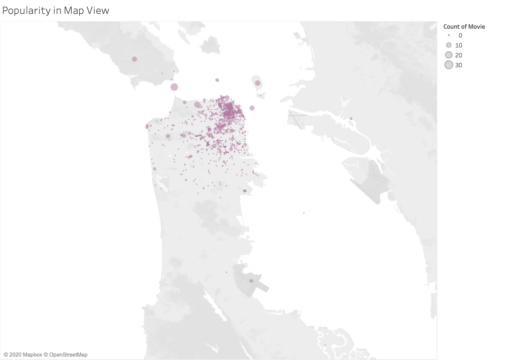
Figure 2: Popularity in Map View
We could see the top-right region more clearly if we also used the colors to represent counts. Although two legends contained duplicated information, differences in both size and color helped distinguish clustered points. There are a couple of popular spots in the cluster, such as “Coit Tower”, “Chinatown” and “Pier 39”. Other small dots are scattered, many of which represent intersections of two streets where some production companies happened to shoot a frame, as revealed in the original data.
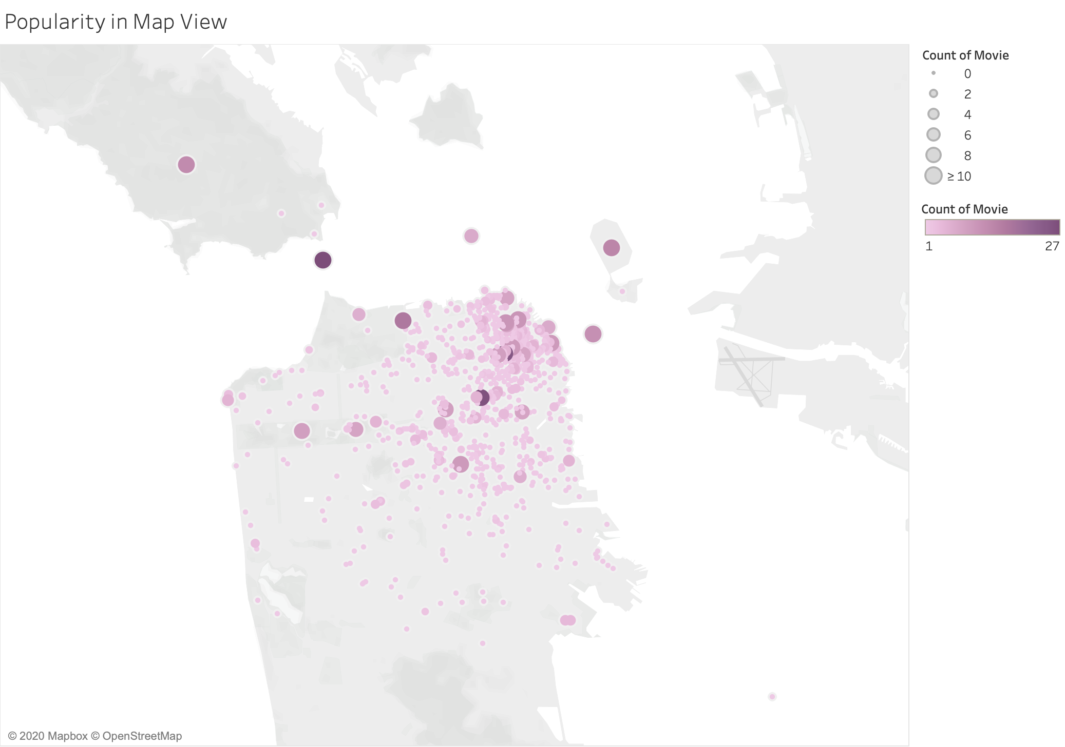
Figure 3: Popularity in Map View
As I zoomed in, sometimes I would see multiple dots at the same locations. This were the byproducts of calling Places API. For example, Places API returns “San Francisco City Hall” if the keyword is “City Hall” and returns “1 Dr. Carlton B. Goodlett Pl.” if the keyword is “San Francisco City Hall”. Both refer to the same place and share the same latitude and longitude, but the names are different.
Currently, I did not have a better solution other than manually modifying addresses as I explored the dataset. I believed it is uncommon for more than two different addresses referring to the same location, and I have checked all places with large counts and made sure popular places have no entity resolution issues.
| Before | After |
|---|---|
.png) |
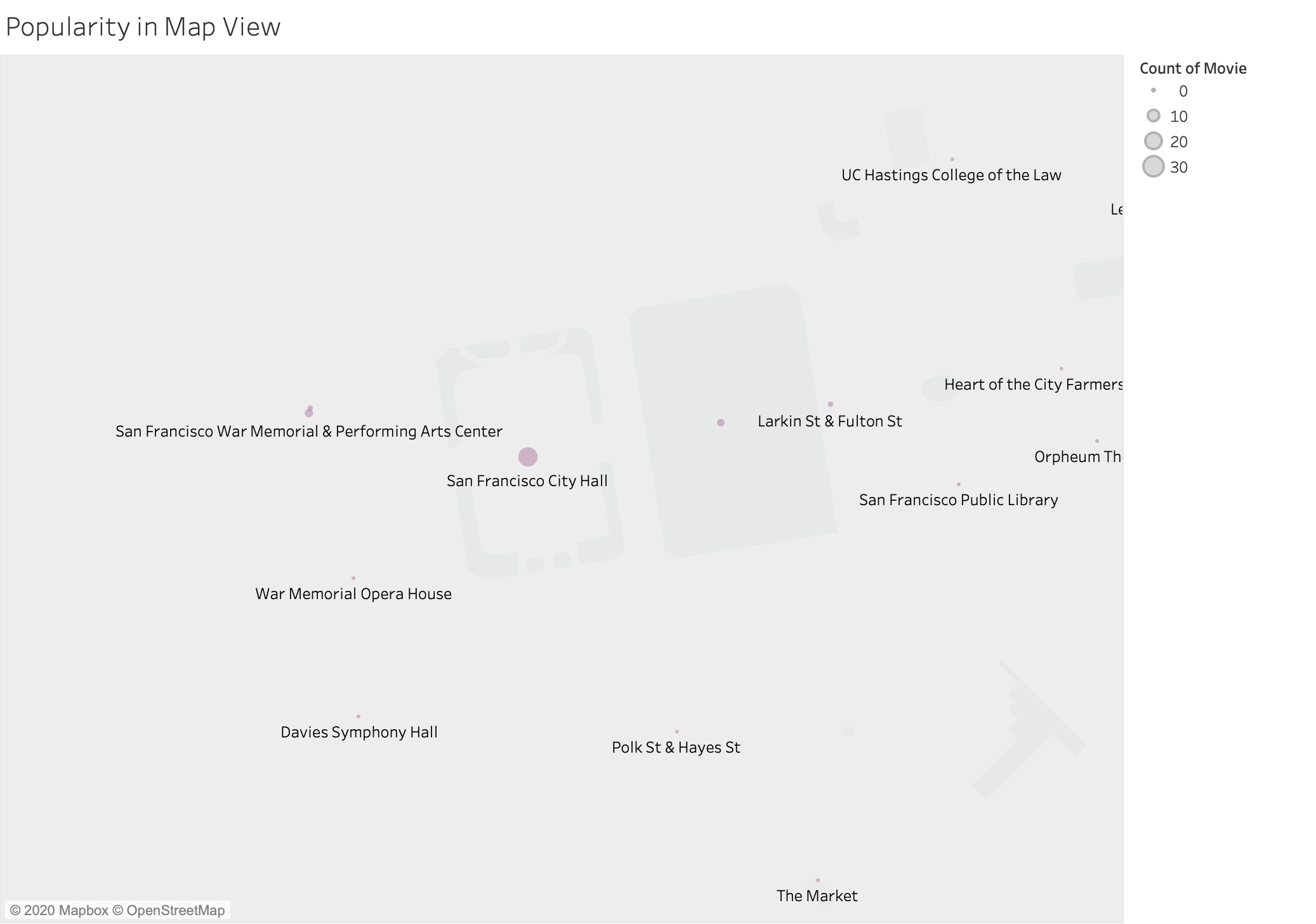 |
Figure 4: (Intermediate Steps) Popularity in Map View
Q3: Which locations are popular among production companies?
In addition to using the number of movies filmed as a metric, I wanted to know which locations are popular among production companies. The following bar chart is similar to the visualization above, except that $y$-axis is the number of distinct production companies. Although the list is not equal, we can see the consistency of popularity in the choices of film locations.
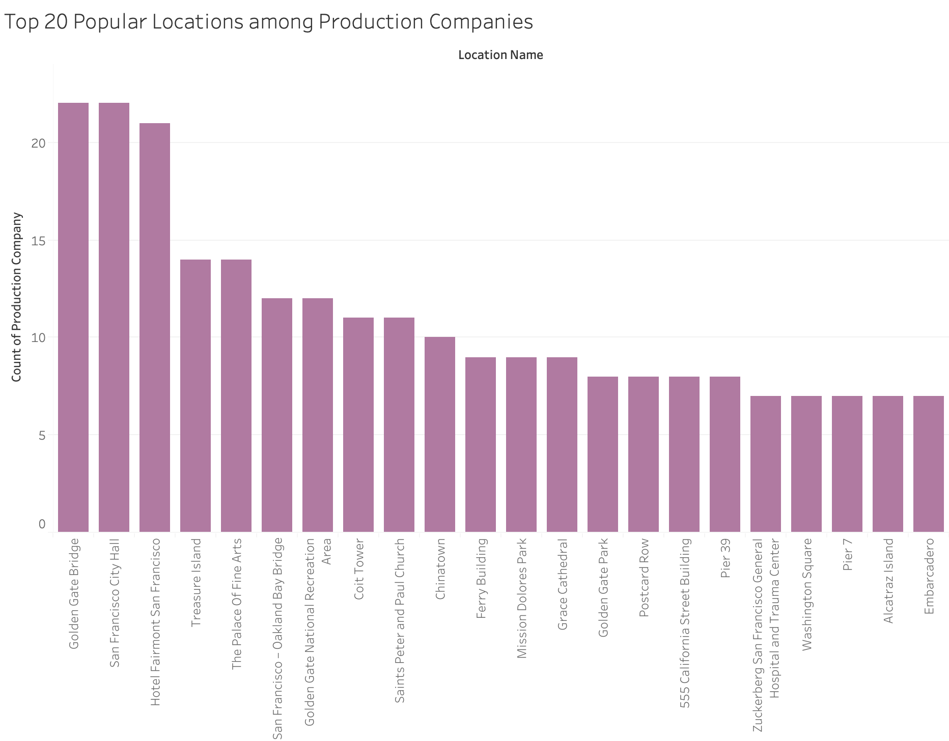
Figure 5: Top 20 Popular Locations among Production Companies
This consistency among popularity in the number of movies and production companies could be shown in the map view as well.
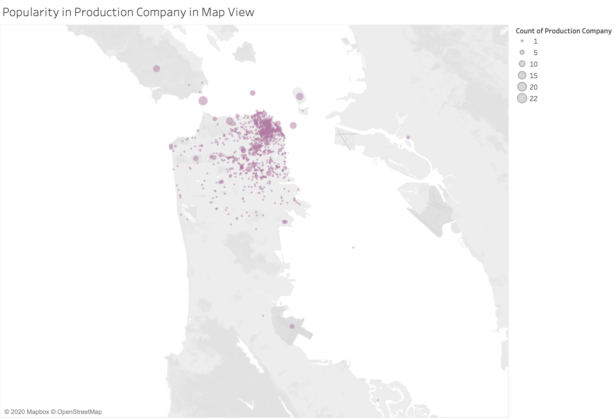
Figure 6: Popularity in Production Company in Map View
Q4: Does such consistency exist?
To further test the assumption, I created the dot chart between the count of movies and production companies per location. Several observations were made from this plot:
- They are positively correlated; if a place appears in multiple movies, more production companies have come to film.
- All dots were below $y=x$, i.e., the number of production companies is no larger than the number of movies, which makes sense in our case. In the dataset provided, if more than one companies shot one film, they were combined and occupied single entry. A potential future direction to go for this assignment is to separate them.
- In fact, during the intermediate step, I did notice a point above $y=x$, and it turned out that there was entity resolution for one company. The point farthest from $y=x$ was “60 Leavenworth St”; one company has filmed frames in that place for 5 movies, which was examined and explained in the next section.
- Three most popular locations (“Golden Gate Bridge”, “San Francisco City Hall”, “Hotel Fairmont San Francisco”) were at the far top right corner. There was a large gap between them and “The Palace Of Fine Arts”, the fourth. This gap could be seen in two bar charts above as well. Most of the places were not that popular, with only a few counts.
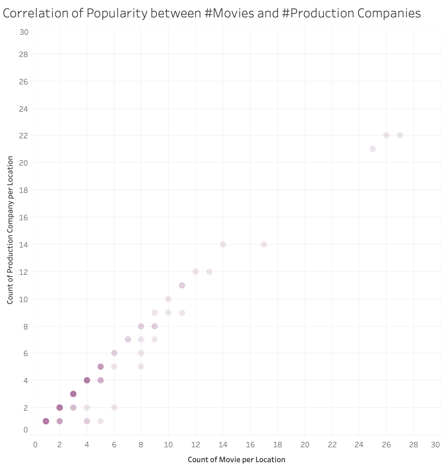
Figure 7: Popularity Correlation
Part 2. Production Companies’ Preference
Q5: Which production companies are in favor of filming in San Francisco?
Another focus is on production companies. “Paramount Pictures”, “Twentieth Century Fox Film Corporation” and “Warner Bros. Pictures” have shot the most number of movies in San Francisco. Since larger studios produce more videos, it makes sense that they have shot more frames in San Francisco. Among the following, while “Columbia Pictures Corporation” is famous, I have not heard of the next two. So I wonder why they prefer San Francisco as the film location.
When doing this step, I noticed that Production Company had duplicated entity resolution issues as well (no screenshot). For example, “Twentieth Century Fox Film Corp.” and “Twentieth Century Fox Film Corporation” referred to the same company, so I went back and modified the data, and changed all related visualizations.
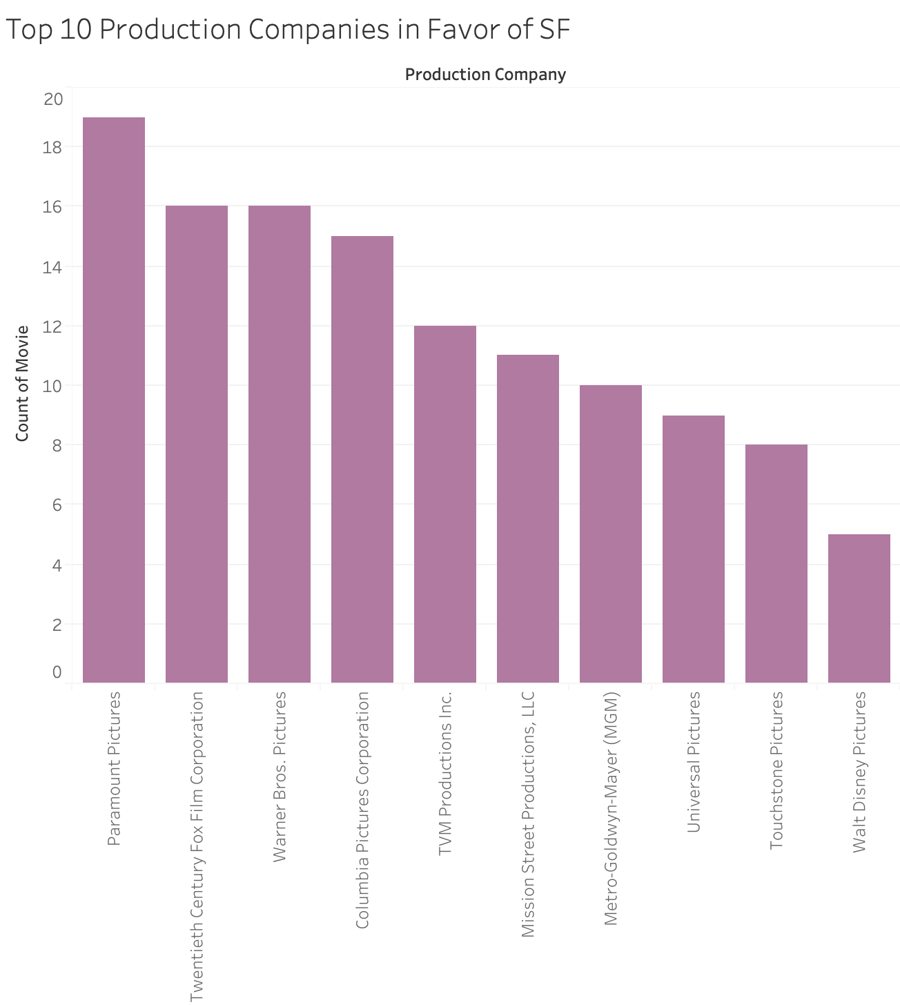
Figure 8: Top 10 Production Companies in Favor of SF
Q6: Which is the taste for each company? In particular, for “TVM Production Inc.” and “Mission Street Productions, LLC”?
Below is a group of bar charts showing the taste of film locations by top production companies. Data are filtered out if the location is not among the top 30 and the production company is not among the top 10. “TVM Productions Inc.” have filmed at “60 Leavenworth St” and “Mission Street Productions, LLC” at “700 Haight St”, and, interestingly, no other companies on this list have filmed at those two places.
Q7: What made those two places special?
I wondered what makes these two places special, so I went back to the data. It turns out that both places were apartments that appeared in some TV series. In the data, each episode is represented as a single movie, and this explains why these normal places have multiple entries. This also answered the previous question in Popularity Correlation.
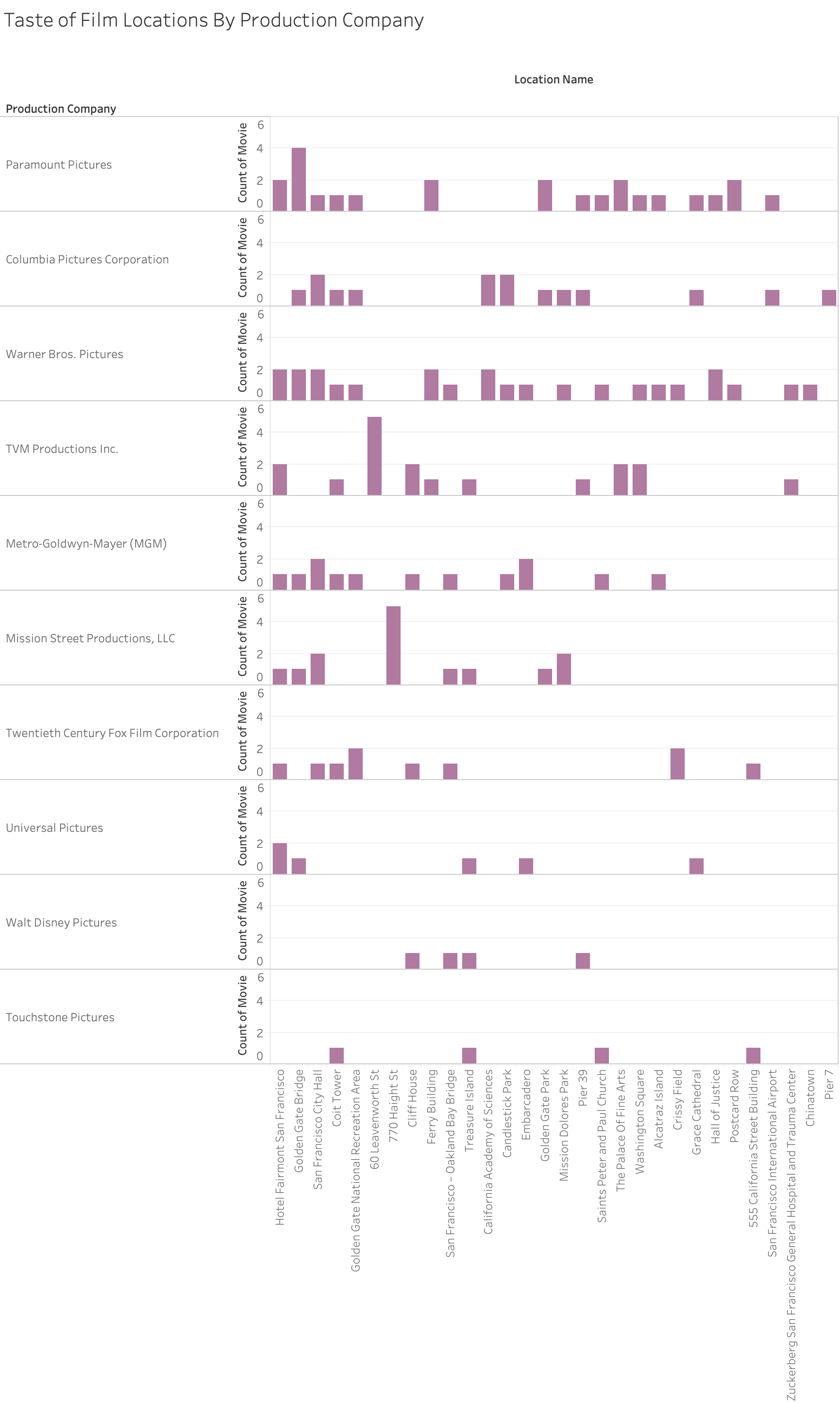
Figure 9: Taste of Film Locations By Production Company
Part 3. Popularity Over Time
Q8: How is the popularity of San Francisco changes over time?
Entries in Release Time was grouped for every 10 years. Overall, San Francisco has gained more and more attention in terms of the number of movies filmed. There was a drop in the 2000s followed by a sharp increase in 2010s.
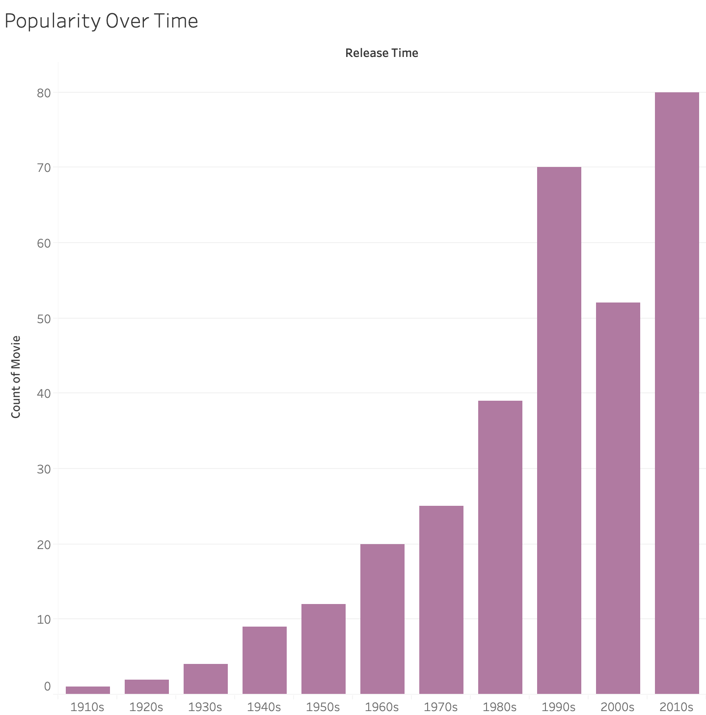
Figure 10: Popularity Over Time
Q9: How about each location? What factors influenced the drop and increase mentioned above?
Below I compared the trend for the top 10 popular locations and could see different patterns. For example, Golden Gate Bridge’s popularity was like a normal distribution and it seemed to already pass its peak time, where it started to decrease after the 1990s. City Hall, although being exposed in a movie once in the 1930s, started to gain more attention since the 1970s. Treasure Island, although among the top 5 popular places, was not famous until the 1990s.
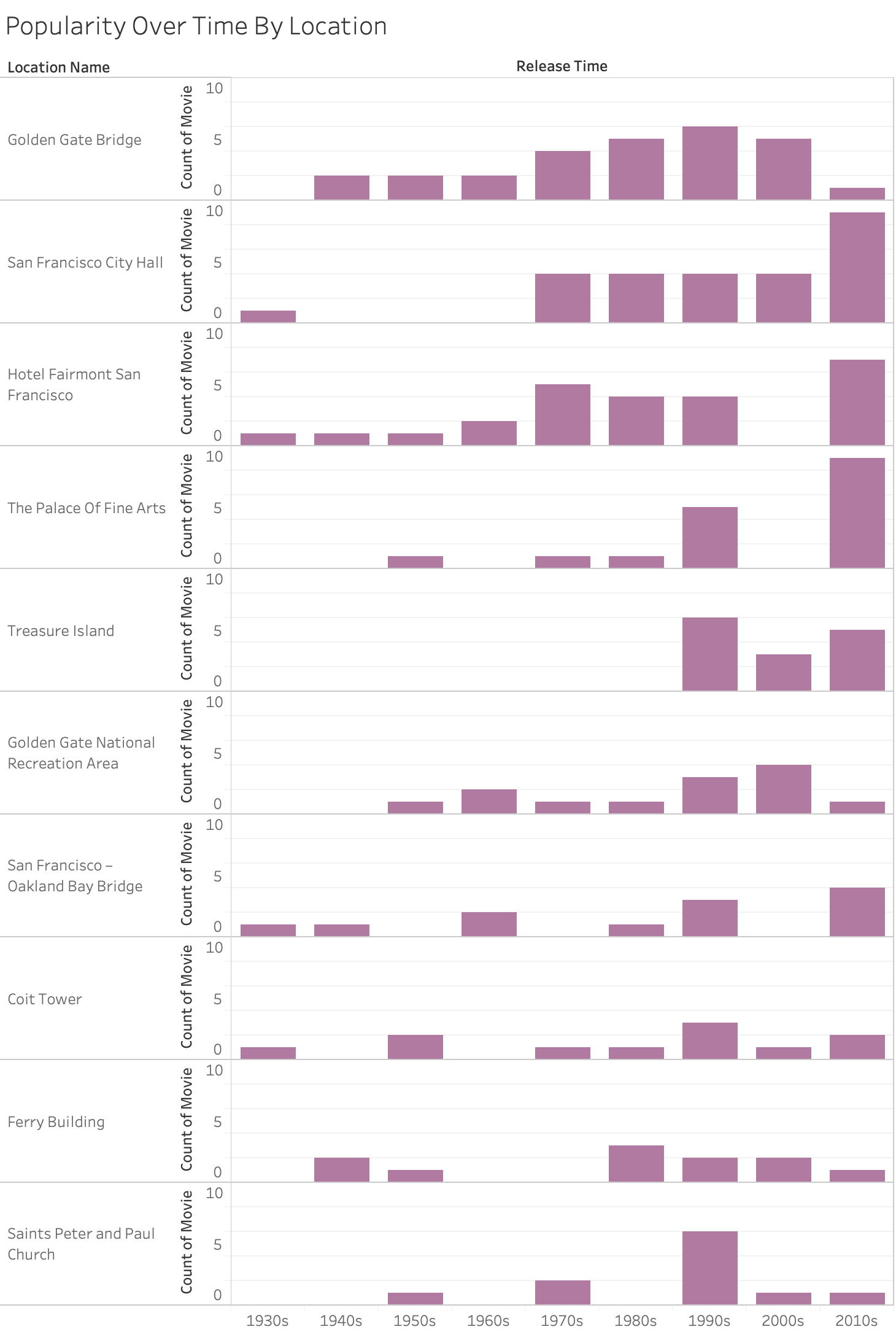
Figure 11: Popularity Over Time By Location
Again, we could use maps to visualize the changes spatially.
- The earliest movies were filmed in “Golden Gate Park” and “Folsom St & 20th St”.
- Since then, number of movies filmed in San Francisco city started to increase gradually, with “Golden Gate Bridge” gaining the most attention.
- In the 2020s, the number of movies filmed in downtown San Francisco shrank dramatically, which possibly resulted in a decrease.
- In the 2010s, although the count for “Golden Gate Bridge” decreased, other places in San Francisco became popular, which resulted in the sharp increase in Figure 5.
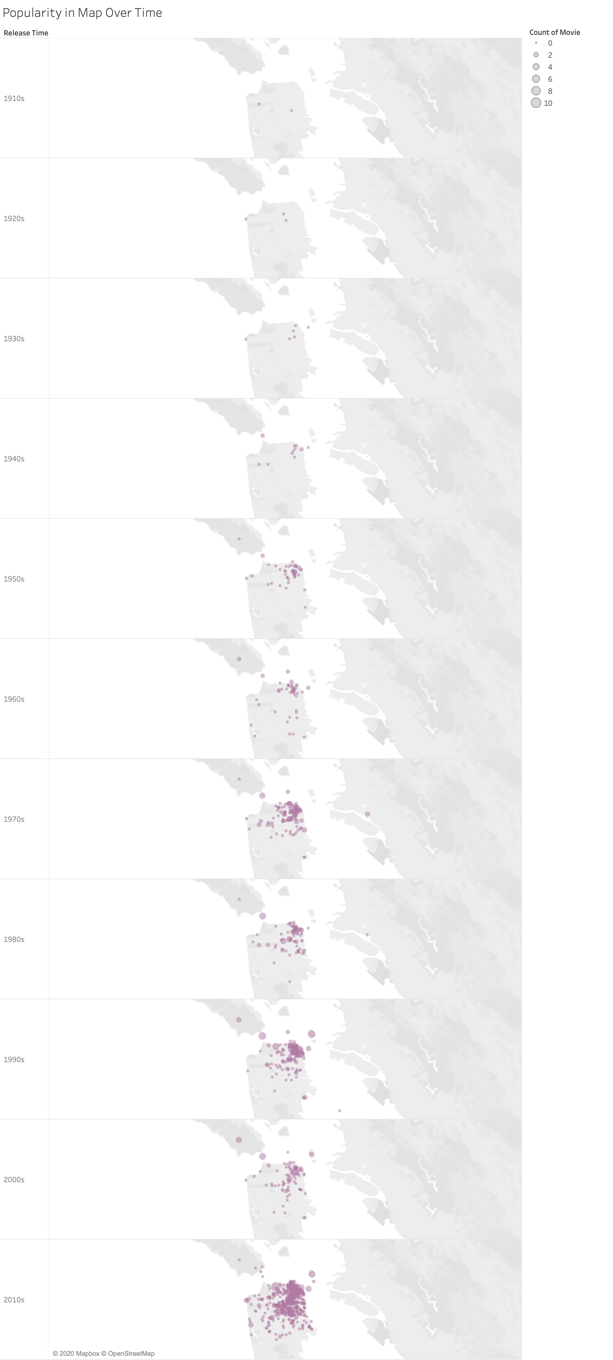
Figure 12: Popularity in Map Over Time
The changes can be better visualized using Release Time buckets as pages in Tableau and with animation. There is no way to insert a GIF in PDF file, so below are screenshots for all the pages. Faded dots indicate data appear before the current period.
.png)
Figure 13: Popularity in Map Over Time